Tax Form Redesign
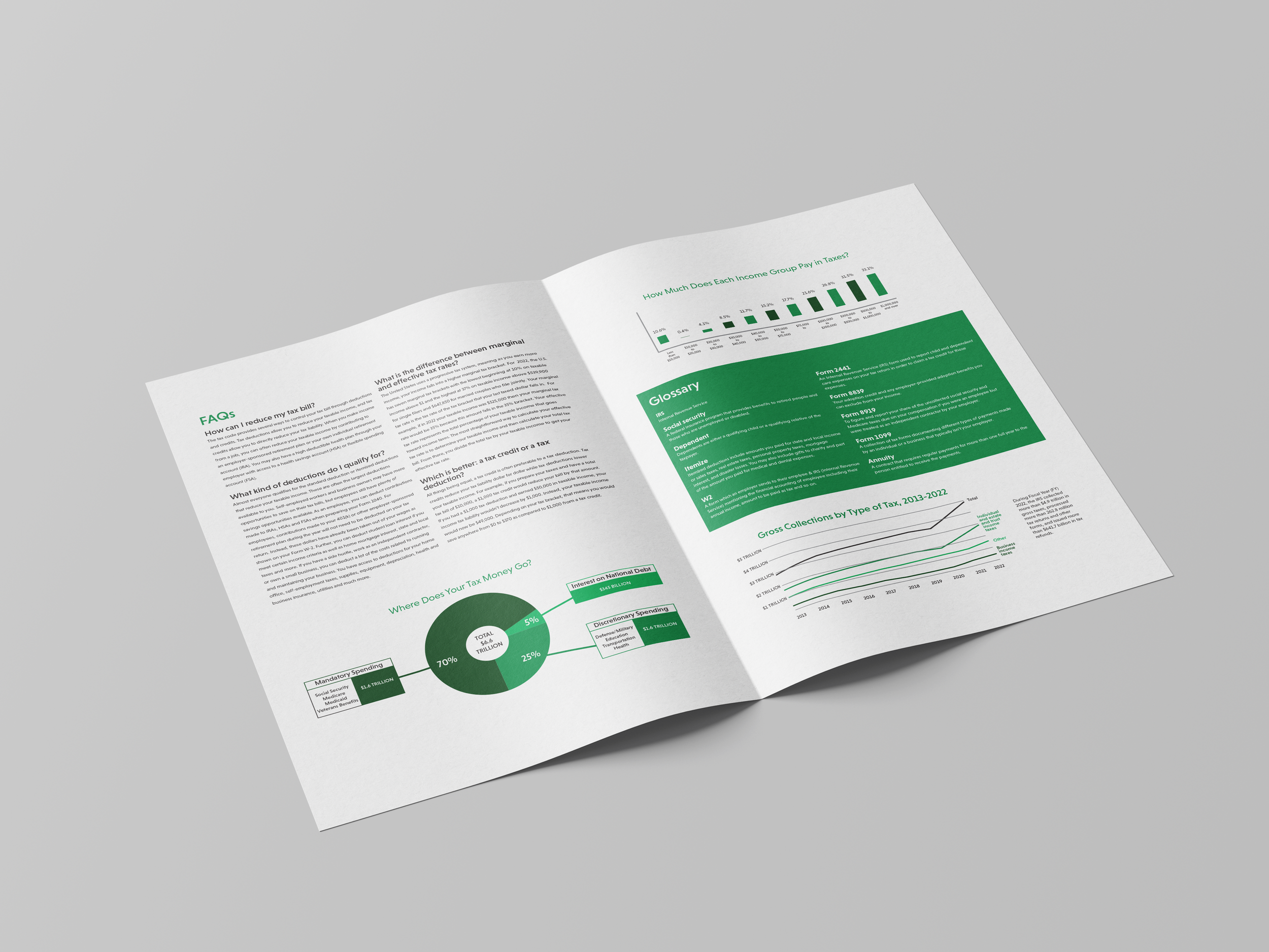
When looking at the original tax form, I wanted to fix hard-to-read areas to make them easier to understand. After talking with many people around me, I found that the way the lines were structured made it confusing and hard to understand what line to go to next. So, I focused on alternating the lines by using white and a light grey, that way people are able to follow the directions more easily. By using the typeface, Niveau Grotesk, I was able to make the text stand out in larger sizes, while also keeping it legible in smaller sizes. On top of redesigning the tax form, I created a newsletter to go along with it. Inside, it includes information and definitions that people might find confusing on the form. Some infographics discuss things like, where your tax money goes or how much each income group pays in taxes.


