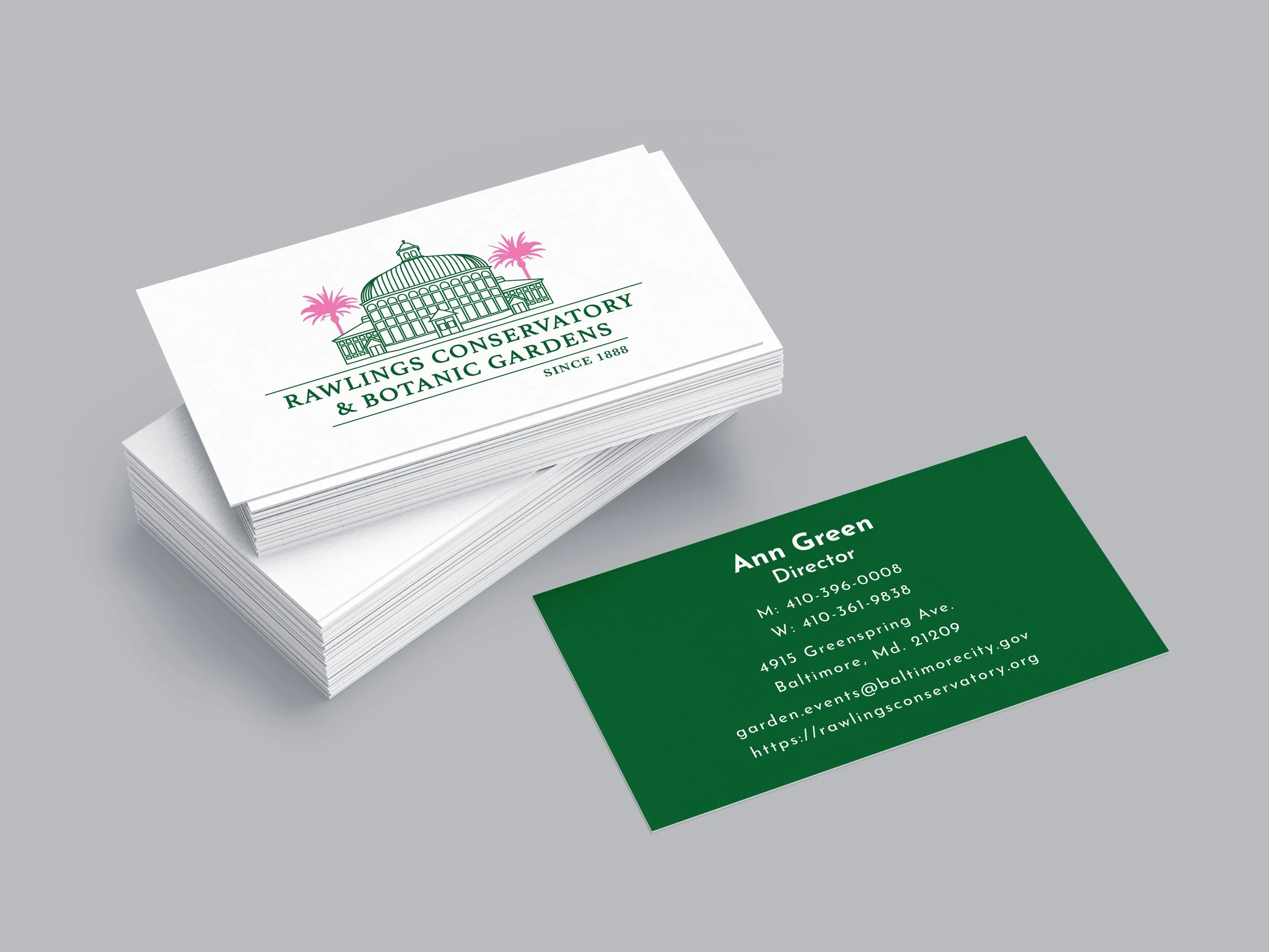
Rebranding for Rawlings Conservatory and Botanic Gardens.
My rebranding for Rawlings Conservatory and Botanic Gardens located in Baltimore, MD involved creating a new logo and brand guidelines for the organization. By visiting the location, it allowed me to get inspired and find out their main mission. Essentially, they want to show an appreciation and understanding of plants from around the world, so for my logo I was really focused on emphasizing the main greenhouse and plants found within the Conservatory, which are their palm trees and orchids. Due to the rich history of the organization, I decided on a serif, Athelas. As a secondary typeface, Jose Fin Sans, felt elegant to complement it. The color palette I used throughout the design is meant to reflect back to the plants and orchids grown in the Conservatory. Using the brand guide, I crafted stationery and business cards to leave a lasting impression on every visitor.


