Hard Seltzer Packaging
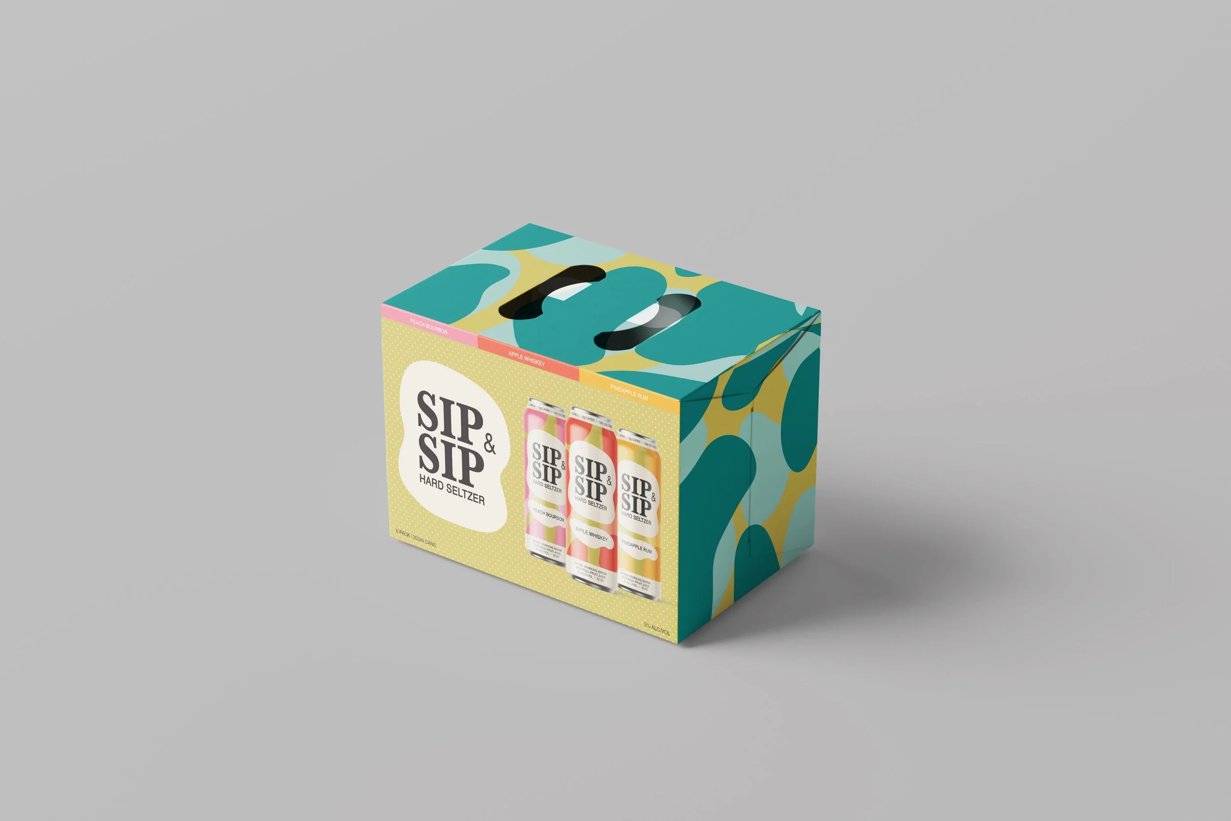
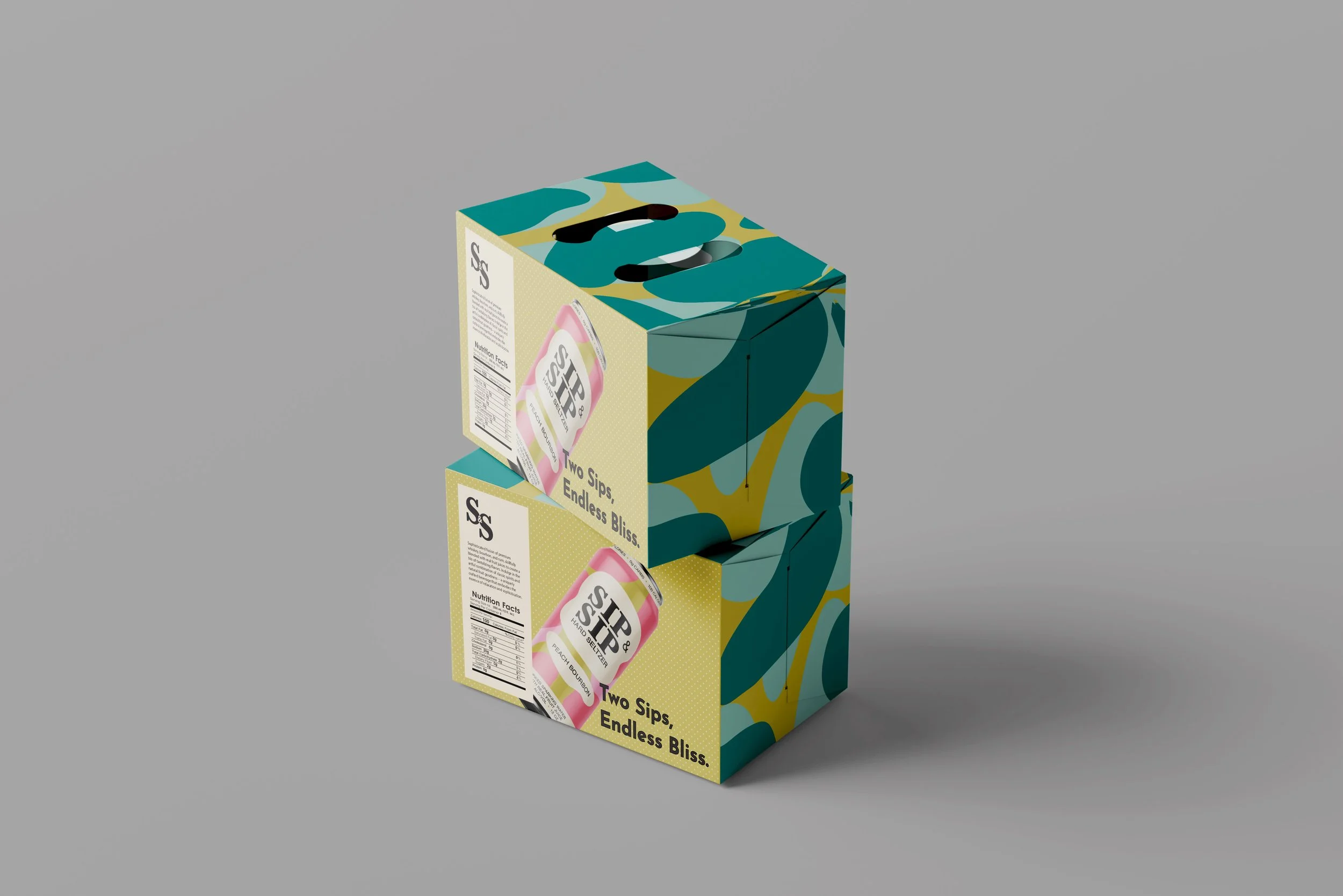
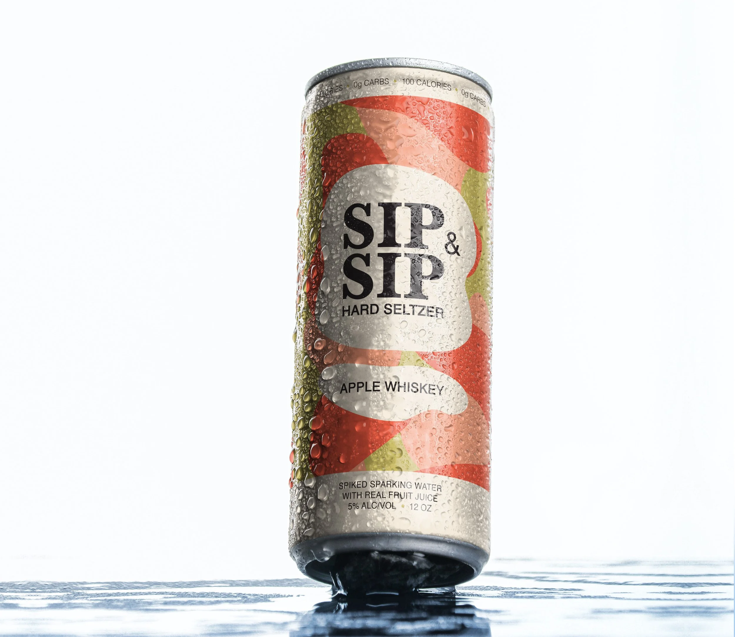
I designed a hard seltzer brand called Sip & Sip. Instead of using vodka or tequila, I wanted to use other liquors, like bourbon, whiskey and rum. The logo uses the serif typeface, Baskerville, to add a bit of sophistication and the sans-serif typeface, Helvetica, for a modern touch. Hard shelters are very popular among young adults so I used fun and bright colors to appeal to them. The organic illustration found on the cans and box is meant to visually communicate the liquid inside the cans and the fresh fruit juice we use for each flavor.


